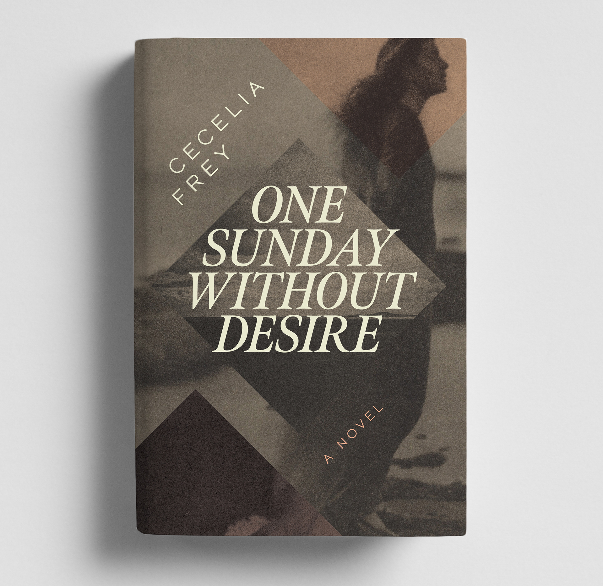
Cover Design | ONE SUNDAY WITHOUT DESIRE | Inanna Press, 2026
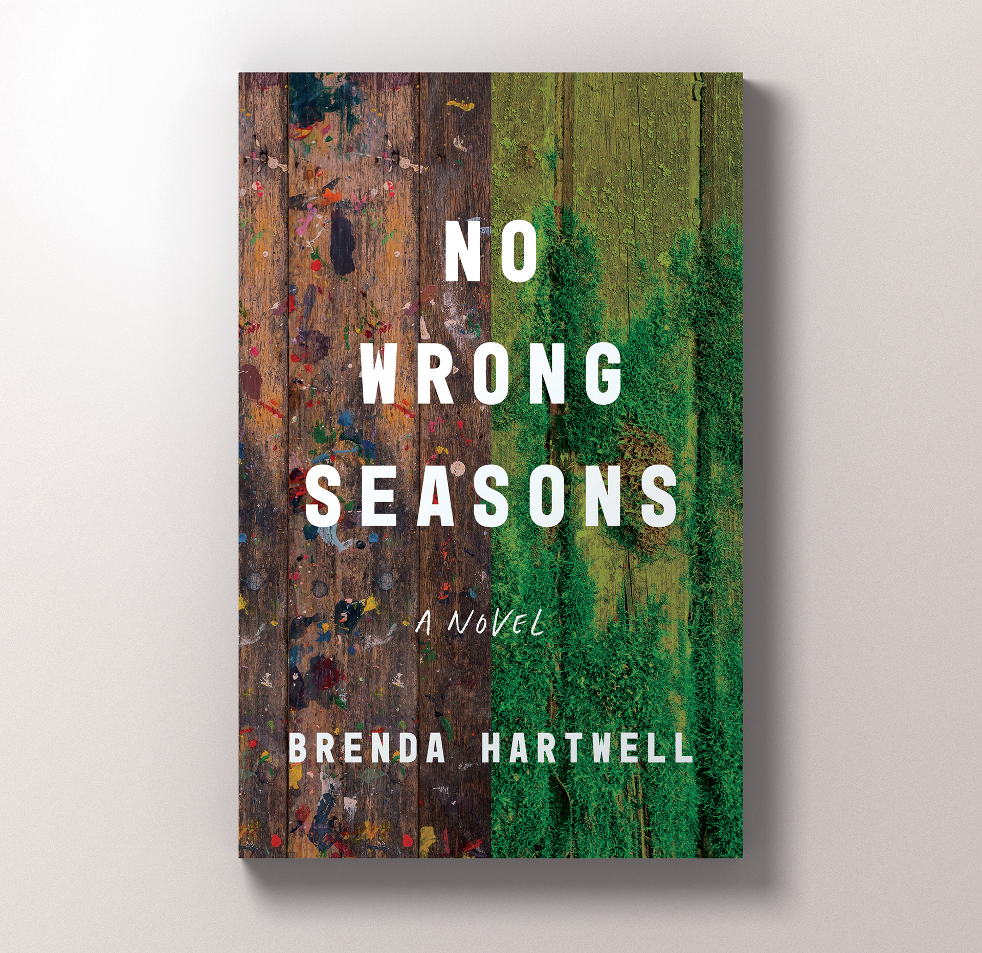
Cover Design | NO WRONG SEASONS | Inanna Press, 2025
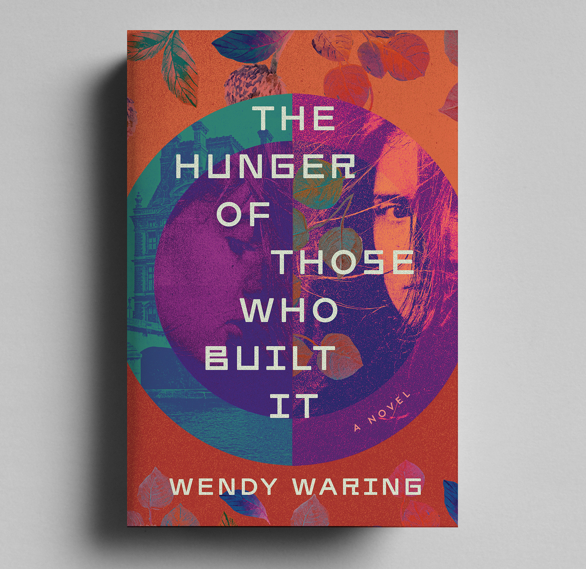
Cover Design | THE HUNGER OF THOSE WHO BUILT IT | Stelliform Press, 2026
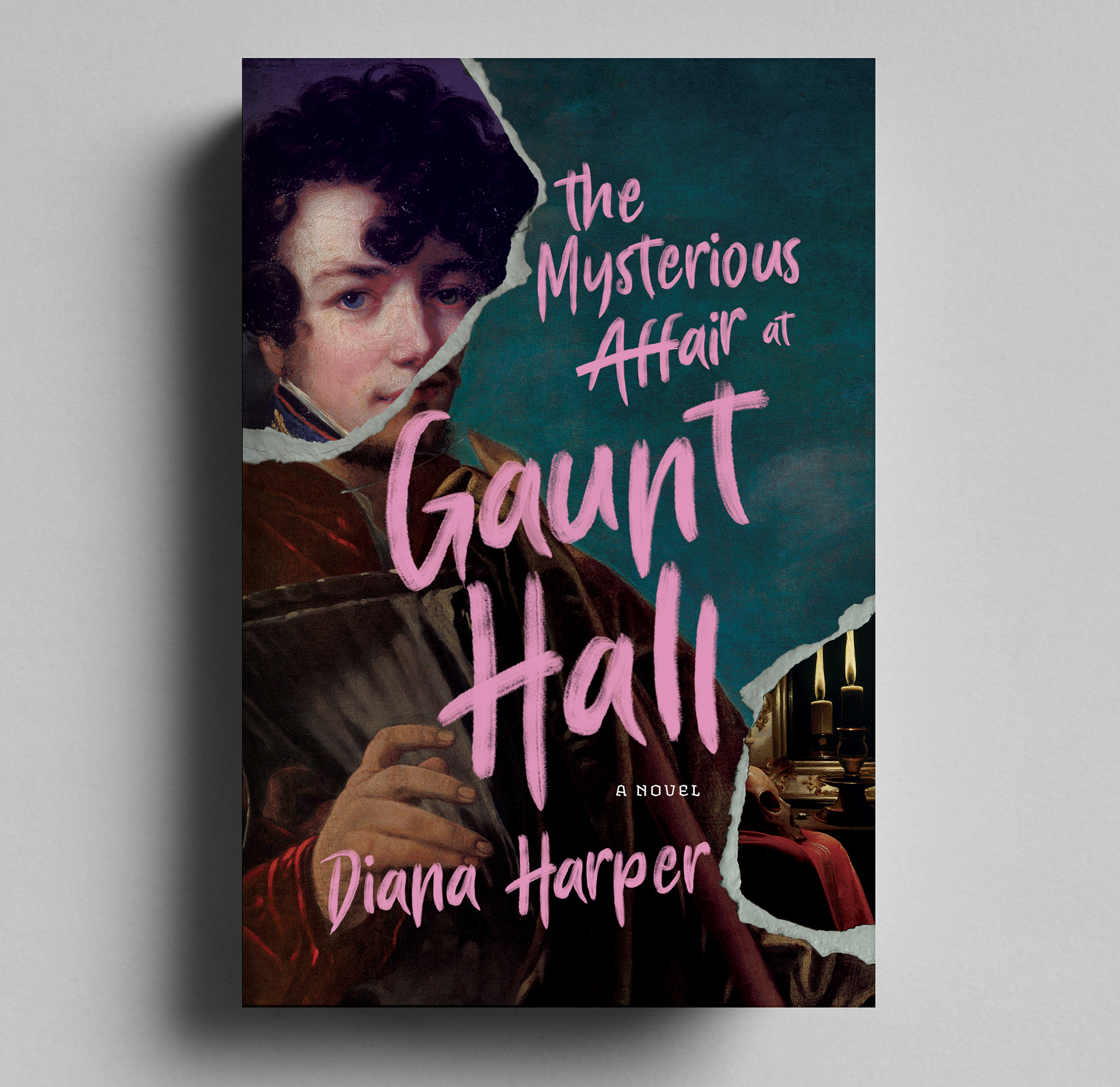
Cover Design | THE MYSTERIOUS AFFAIR AT GAUNT HALL | 2026
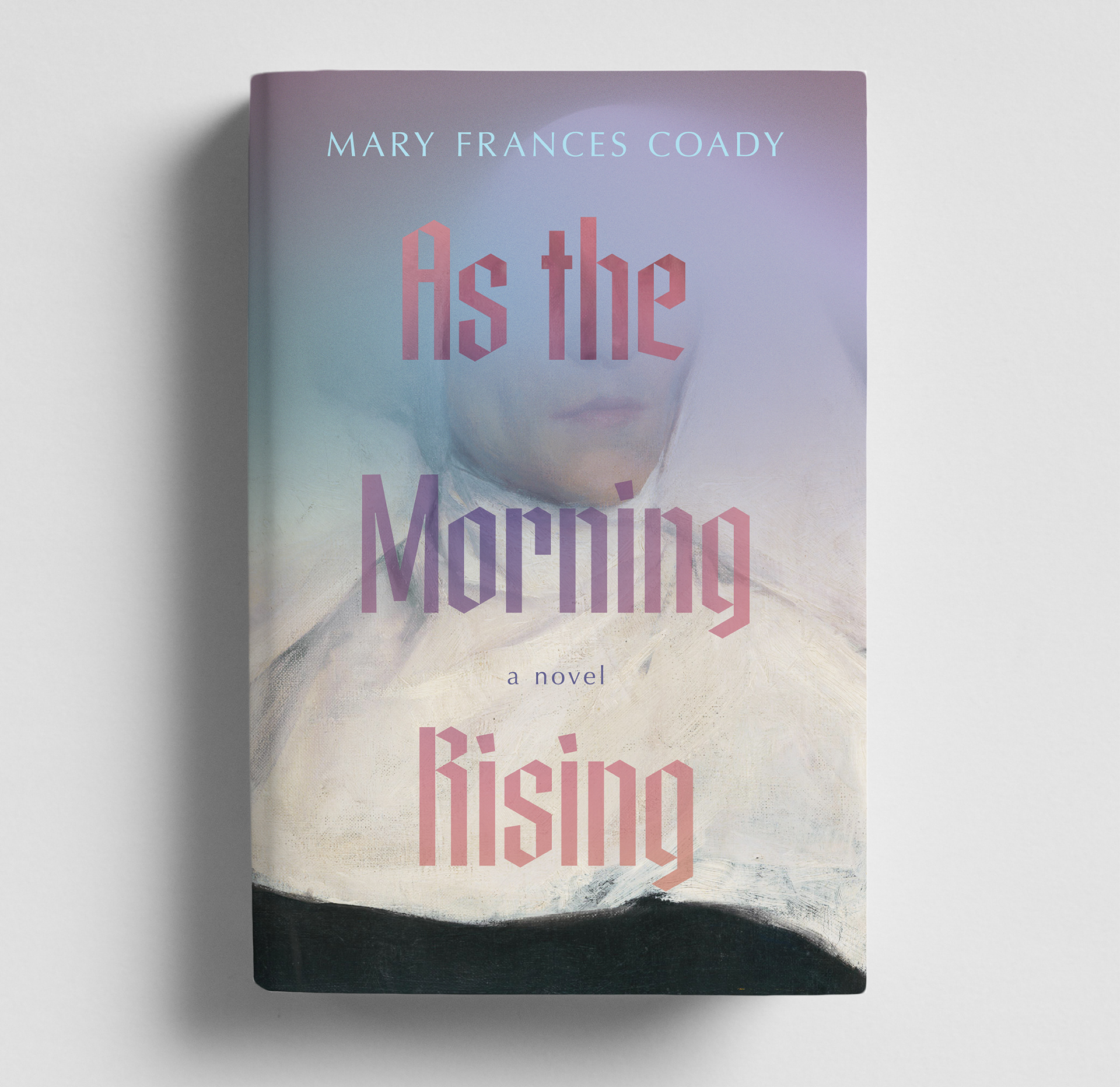
Cover Design | AS THE MORNING RISING | Inanna Press, 2026
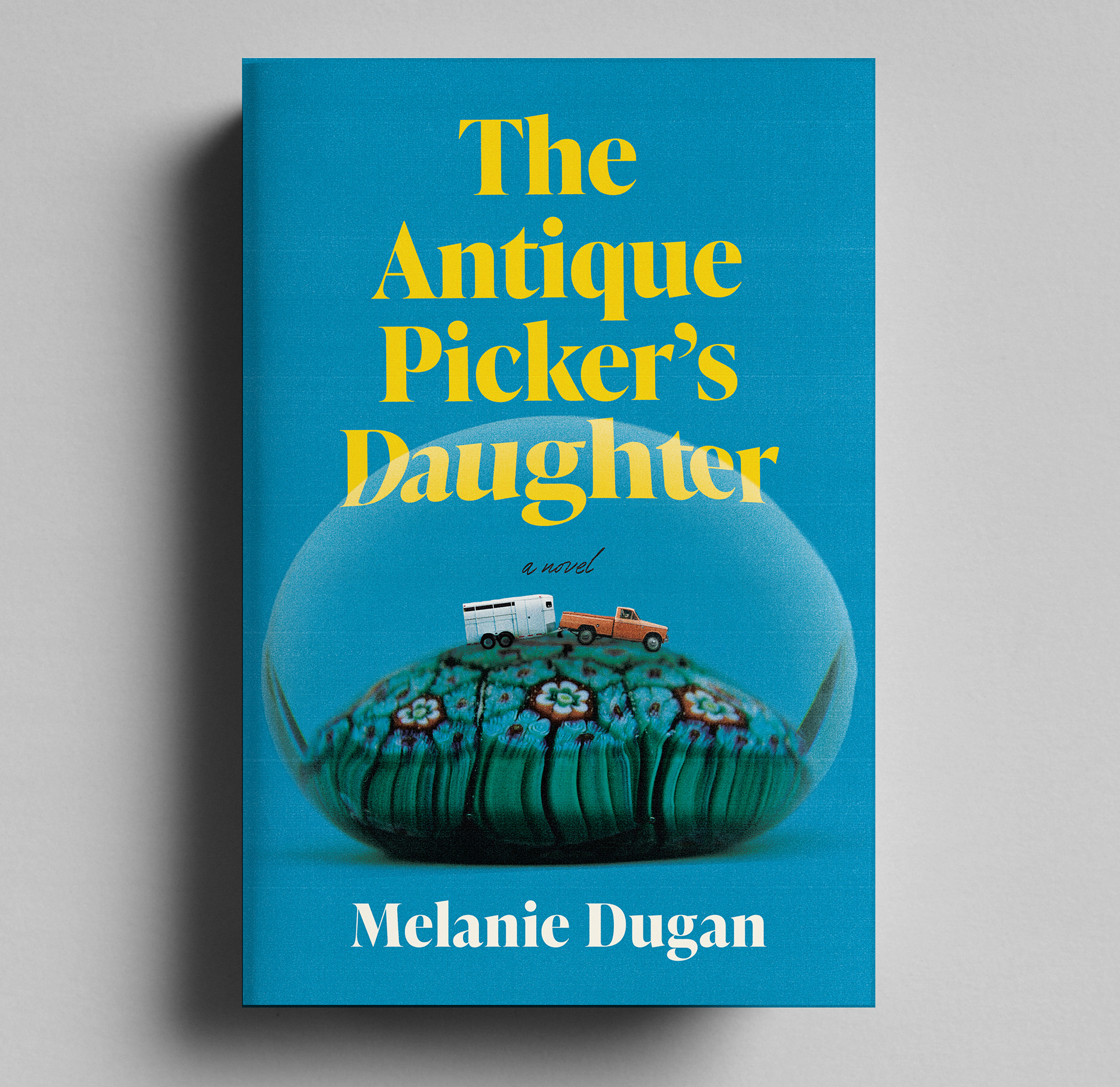
Cover Design | THE ANTIQUE PICKER'S DAUGHTER | Inanna Press, 2026
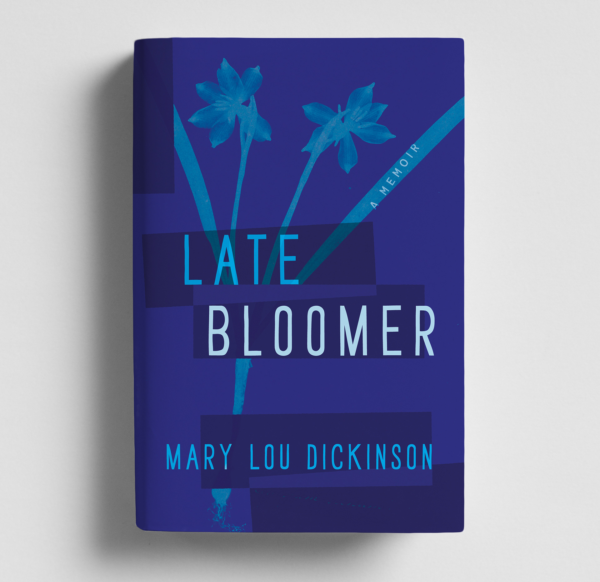
Cover Design | LATE BLOOMER | Inanna Press, 2026
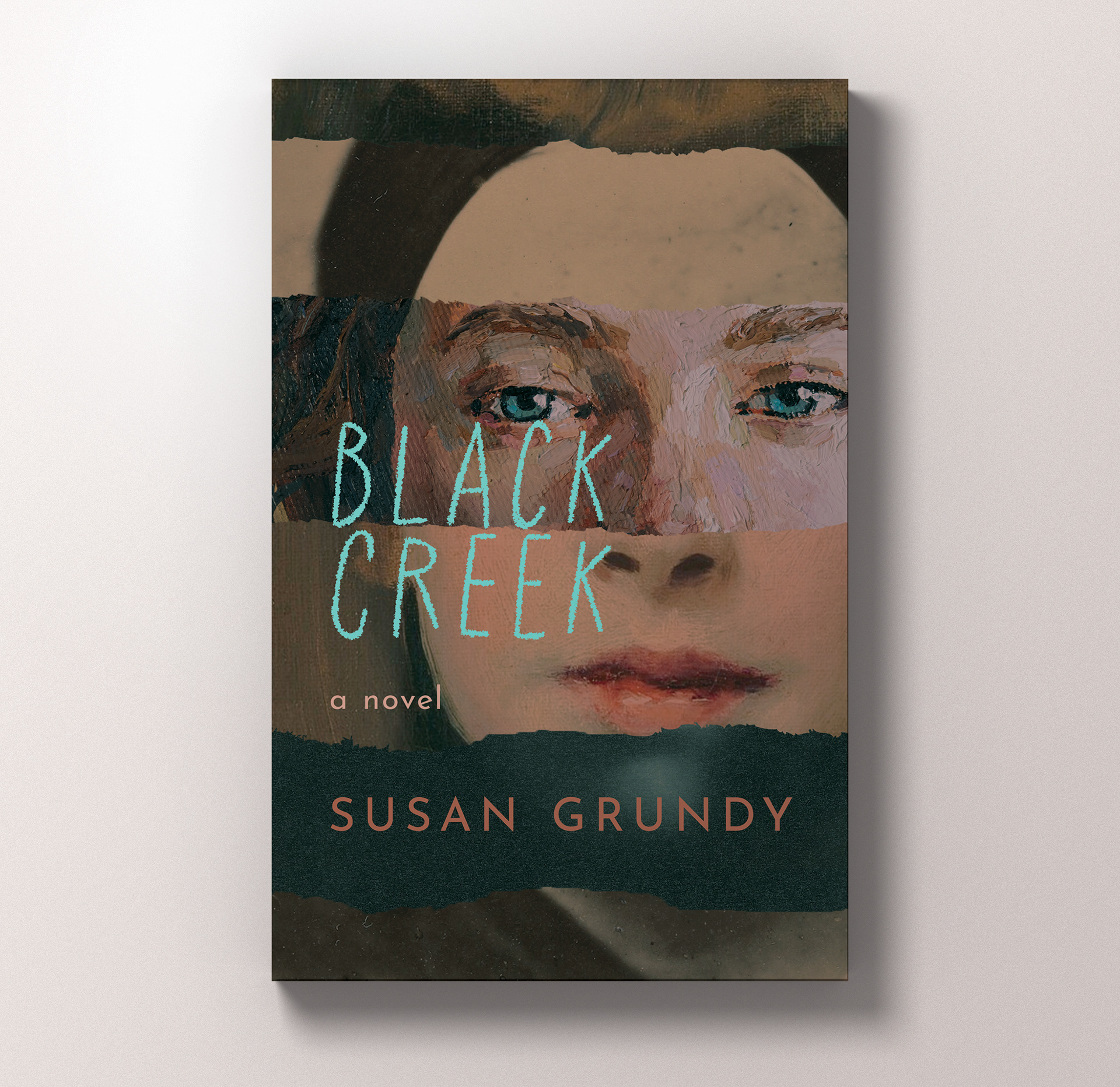
Cover Design | BLACK CREEK | Inanna Press, 2025
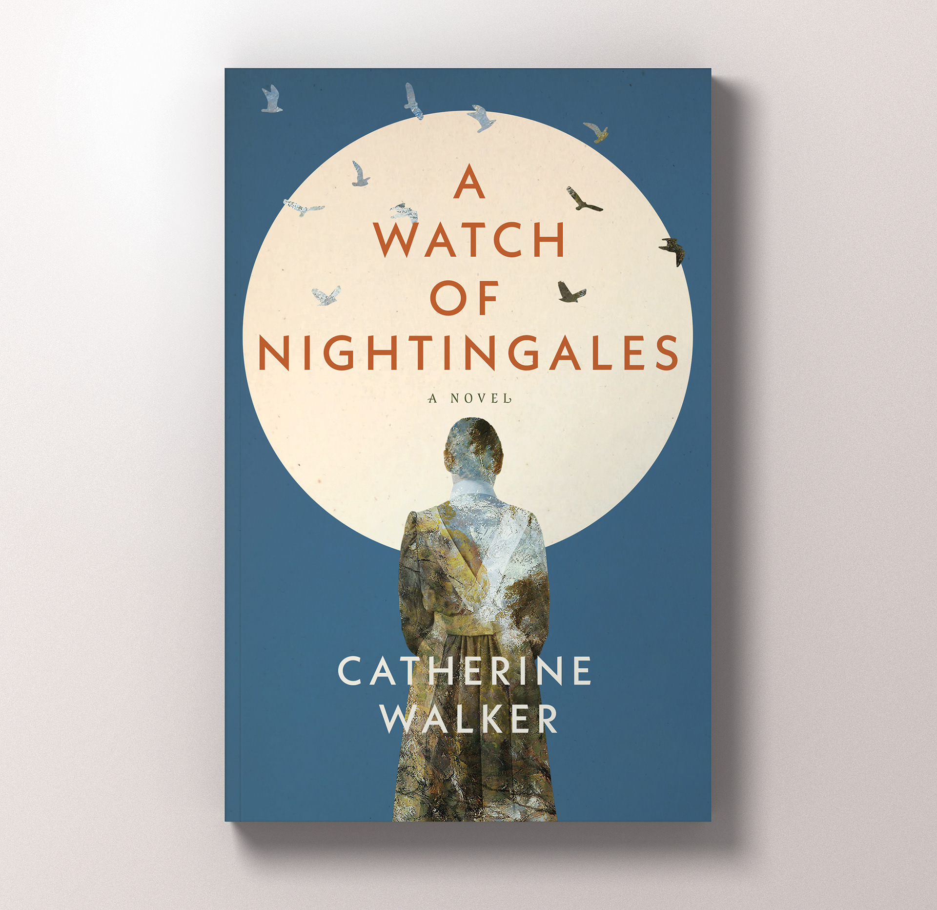
Cover Design | A WATCH OF NIGHTINGALES | Inanna Press, 2025
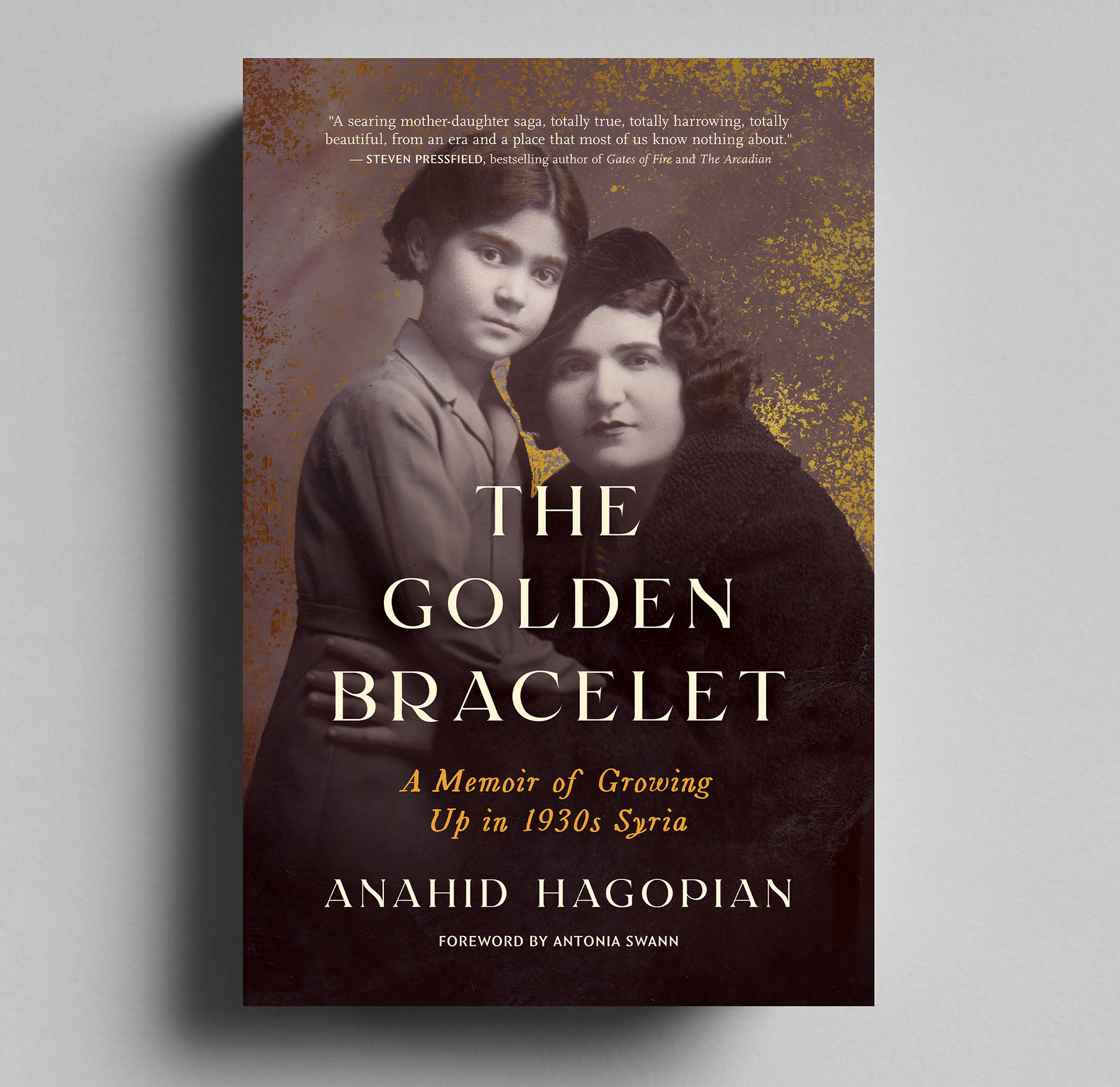
Cover Design | THE GOLDEN BRACELET | Inanna Press, 2026
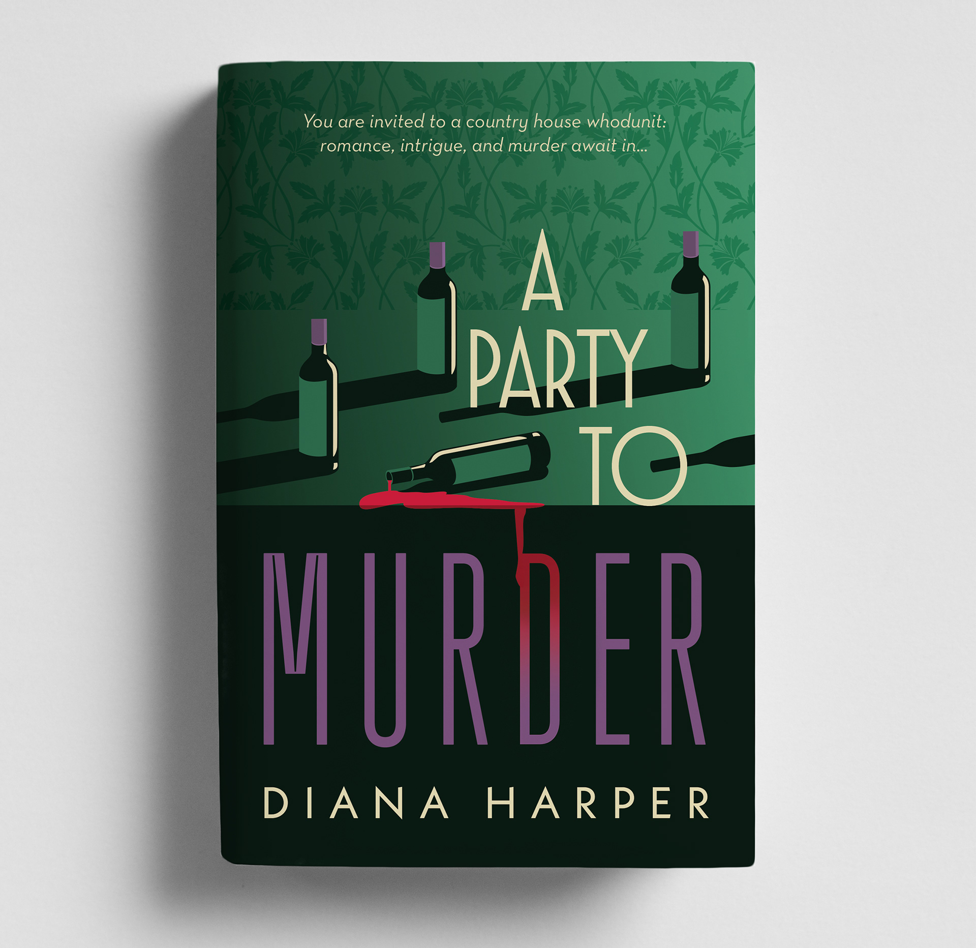
Cover Design | A PARTY TO MURDER
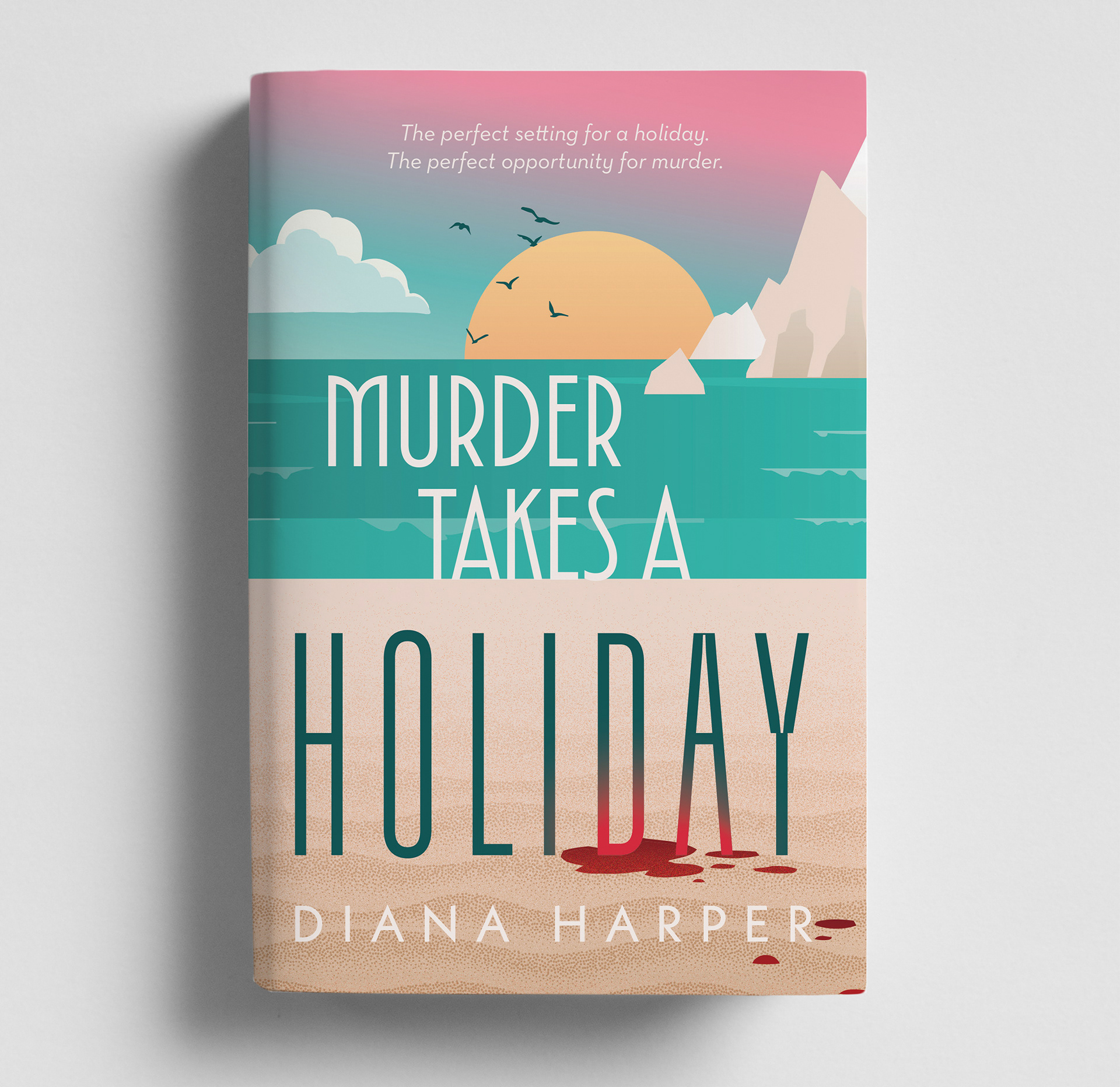
Cover Design | MURDER TAKES A HOLIDAY
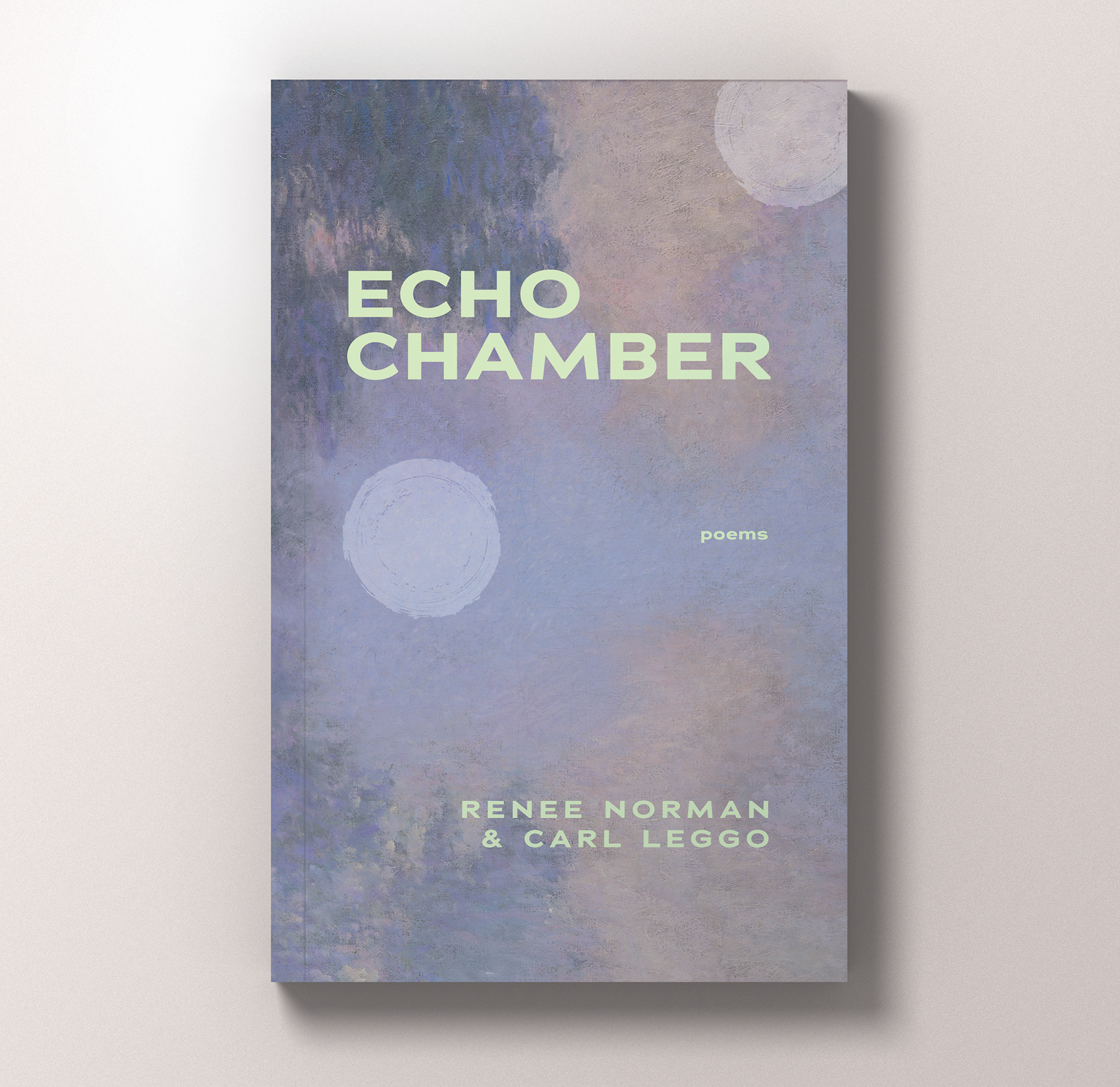
Cover Design | ECHO CHAMBER | Inanna Press, 2025
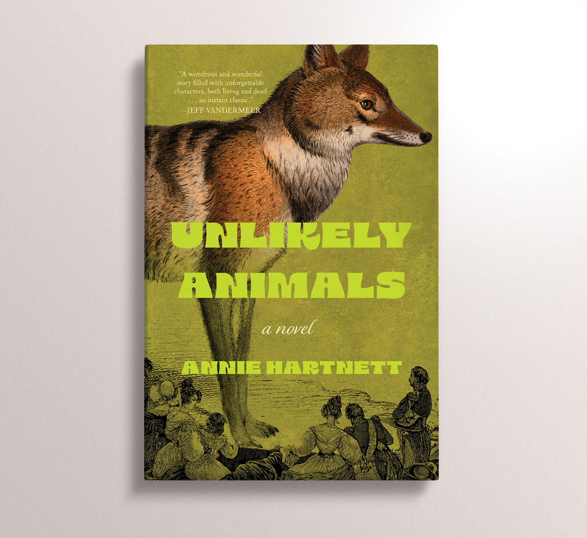
Self-directed personal project / This cover for Annie Hartnett's delightful literary fiction novel alludes to some of the absurd narrative devices and themes, while using type and imagery that is aligned with the playful and often very funny ways the story surprises the reader.
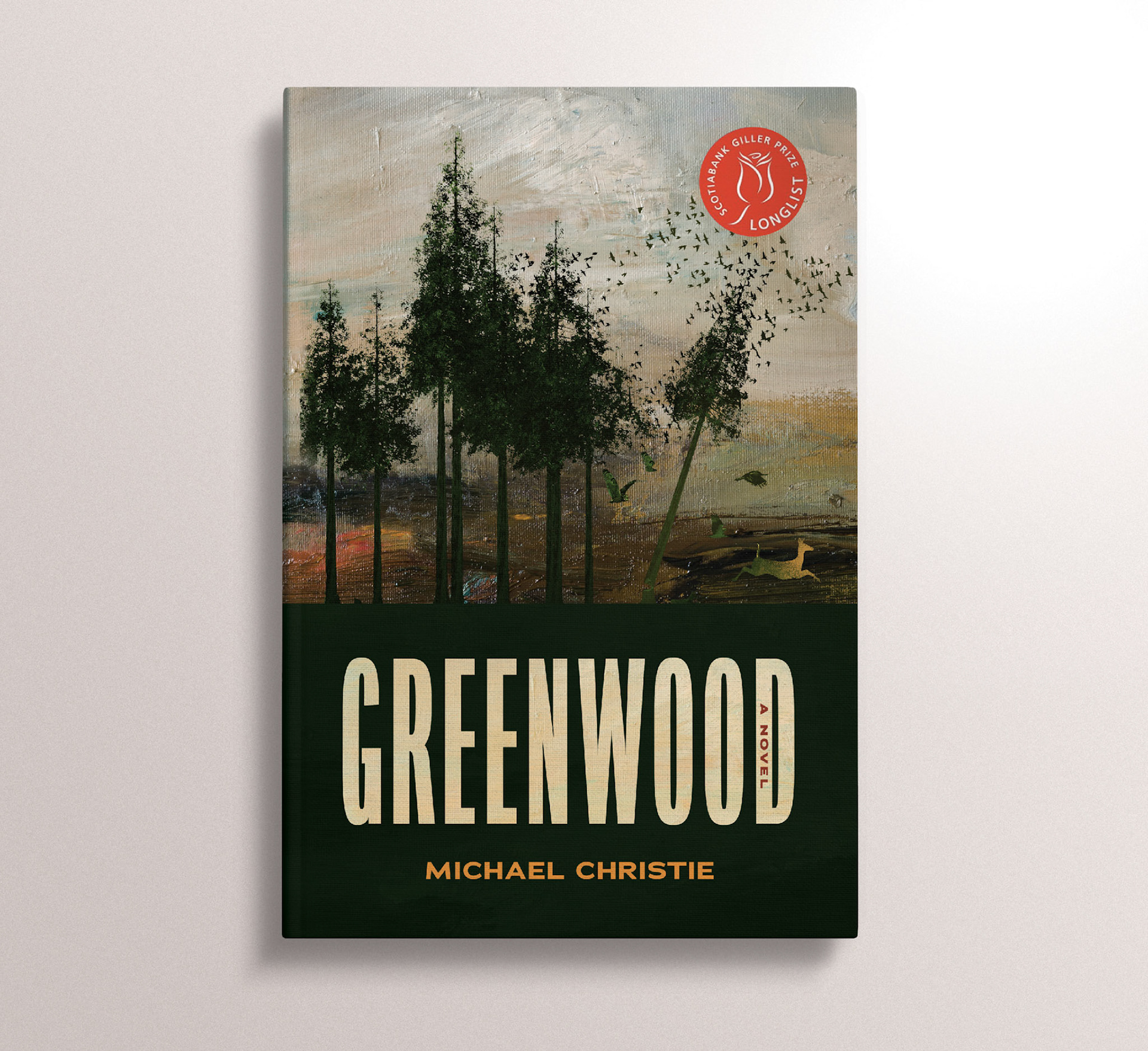
Self-directed personal project / This cover is more explicit in its portrayal of the climate-disaster themes in "Greenwood," while using traditional textures and organic colours that are appropriate for a family saga that expands generations.
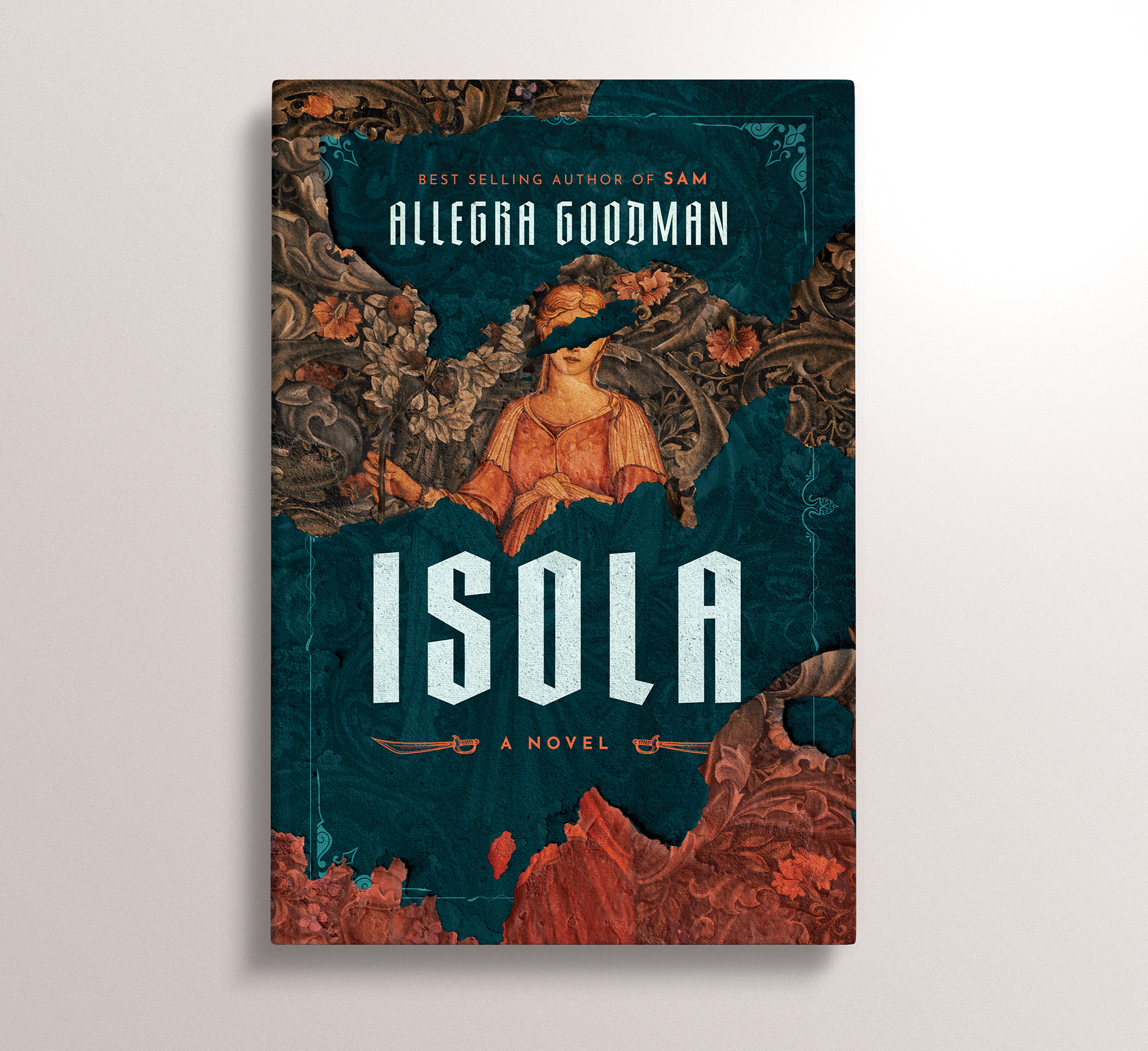
Self-directed personal project / This cover for "Isola" leans more directly on the historical context of the novel than the original cover, allowing readers a glimpse into 16th century the era they will be immersed in by Goodman's poetic and archaic prose.
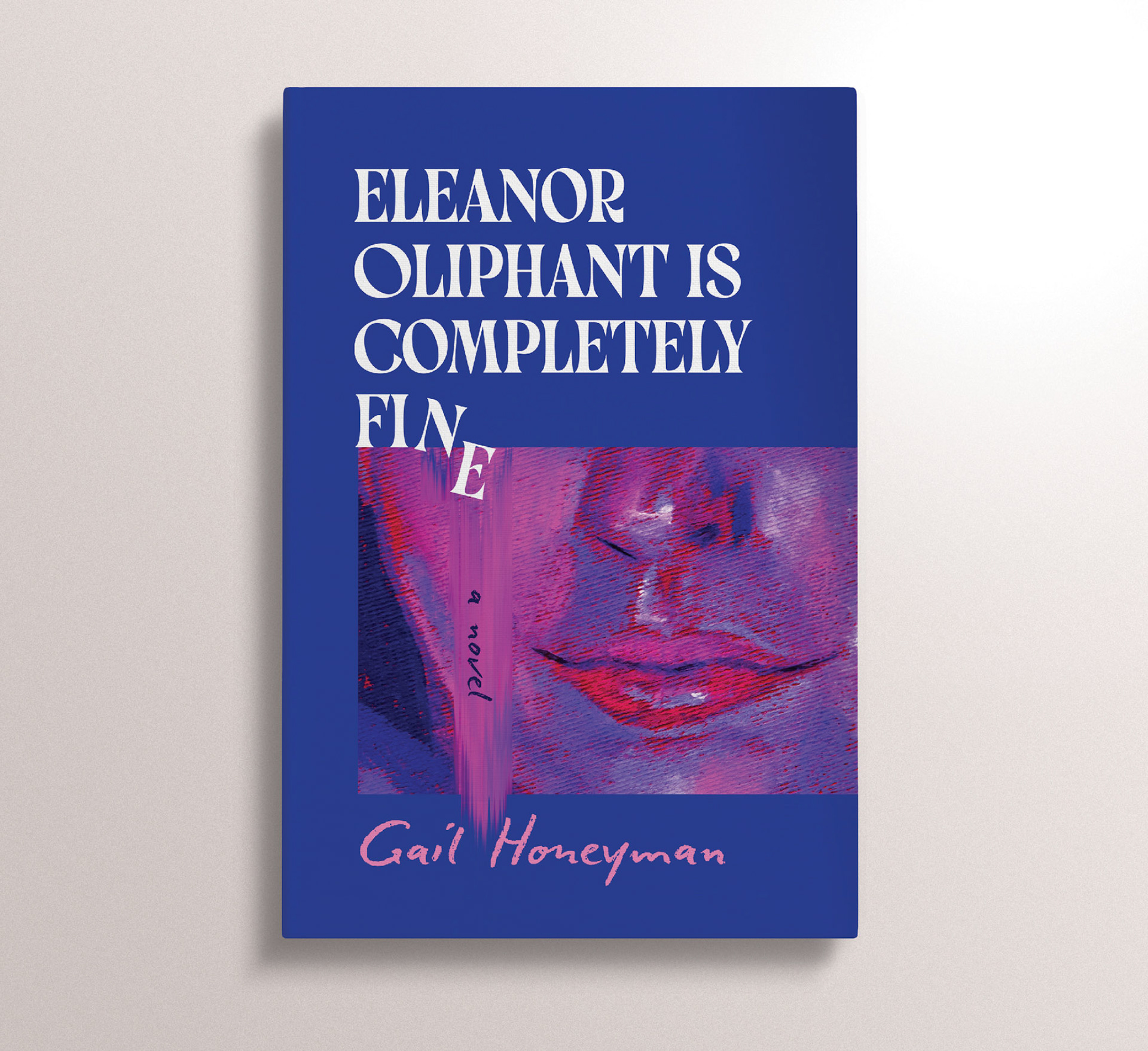
Self-directed personal project / This cover embraces some of the darker themes explored in this widely popular contemporary fiction novel. It offers up a cover that is still commercially engaging, while using bold colours and imagery to match the protagonist's bold personality and narrative voice.
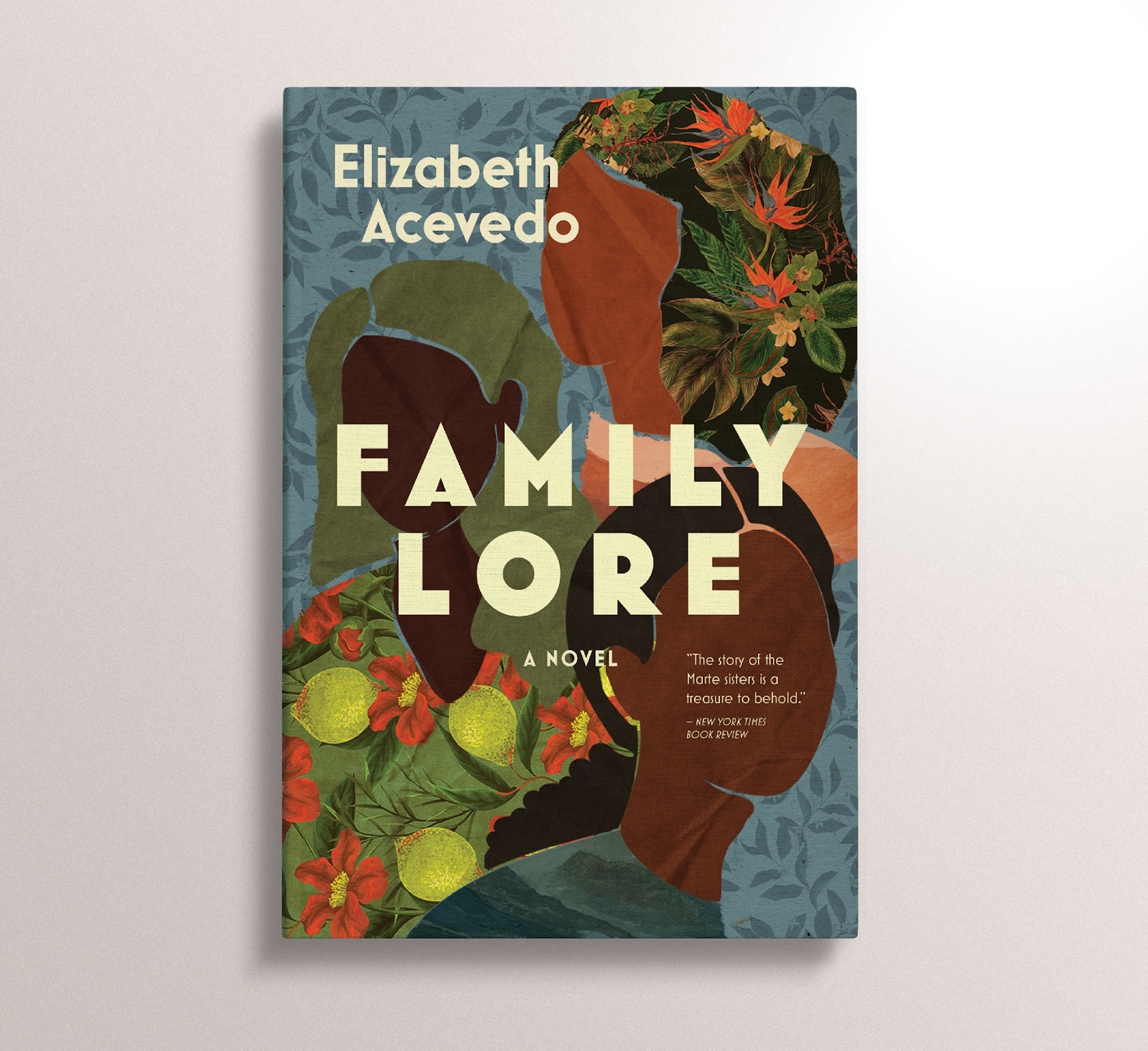
Self-directed personal project / This alternative cover for "Family Lore" uses more muted tones than the blue covers currently on market, in hopes of growing Acevedo's audience beyond the younger audience she's cultivated with her previous YA novels.
Self-directed personal project / This alternate cover of "Project Hail Mary" leans further into the sci-fi tropes that serve as the backdrop for Weir's novel, while introducing some brighter colours and open up the novel to readers of all genders.
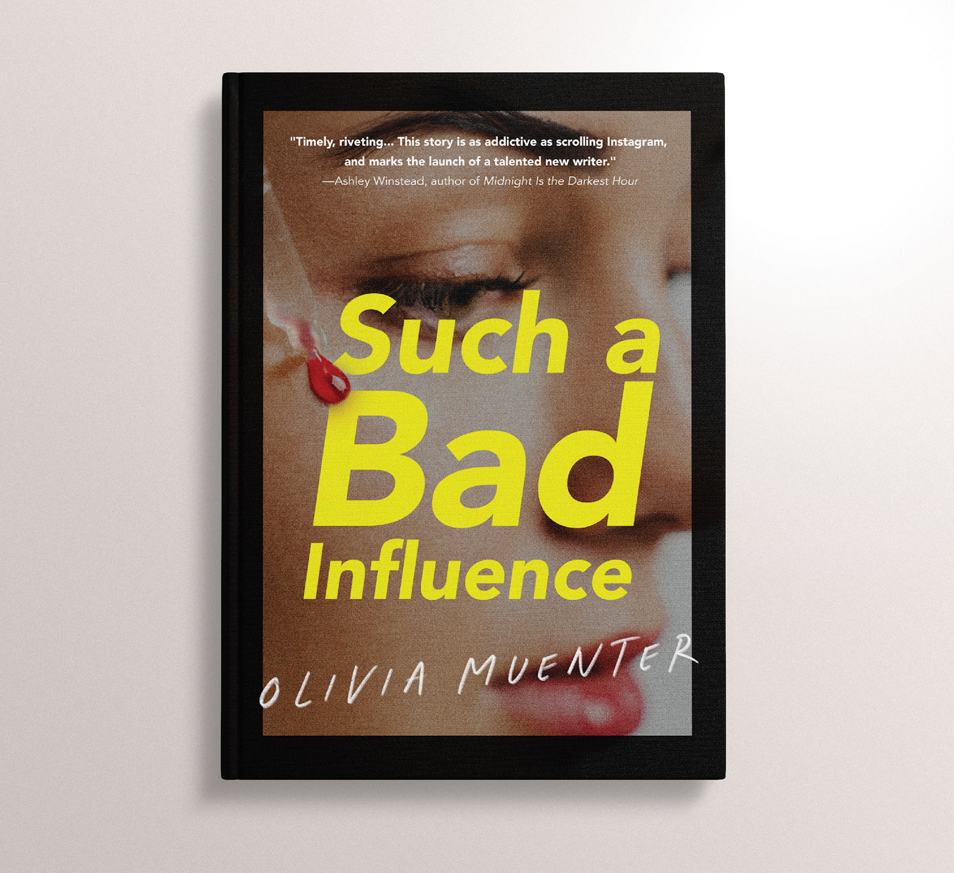
Self-directed personal project / This alternate cover for Olivia Muenter's debut thriller expands upon the original text-based cover design. I selected an image that perfectly gels with the themes of social media mania, and added an ominous touch of blood to prime the reader for the sharp observations found within the story. The title type is a wink at Barbara Krueger's work, as she was similarly interested in interrogating our image-obsessed, consumerist culture!
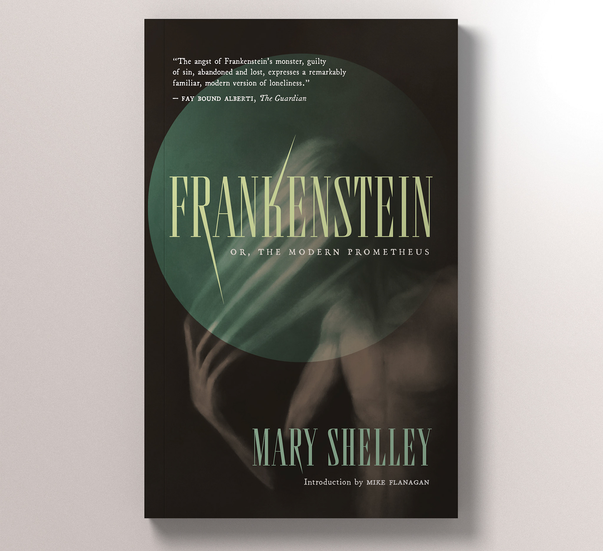
This alternate cover of Frankenstein is looking to connect with an audience that likes historical fiction, folk horror, and gothic romance. The ideal reader of this Frankenstein values being scared and unsettled, but not without deep emotional exploration and resonance. There is a sense of anguish in the image, and menace in the type.
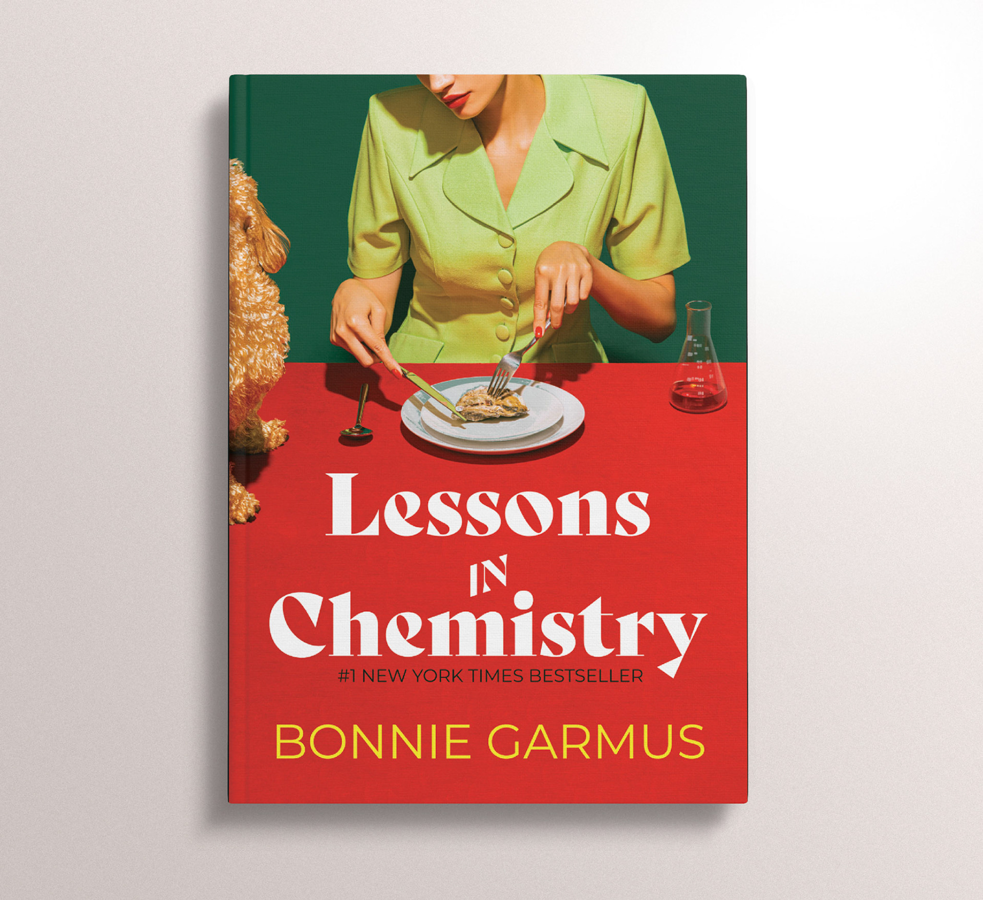
Self-directed personal project / This alternate cover for Lessons in Chemistry seeks to rectify the dissonance readers noted between the heavier themes explored in the novel, and the neon orange cartoon cover of the initial paper back design. This cover embraces the 1960s setting, while still including some of the more playful elements of the story (ie: the narrating dog), and choosing and audacious type and colour palette.
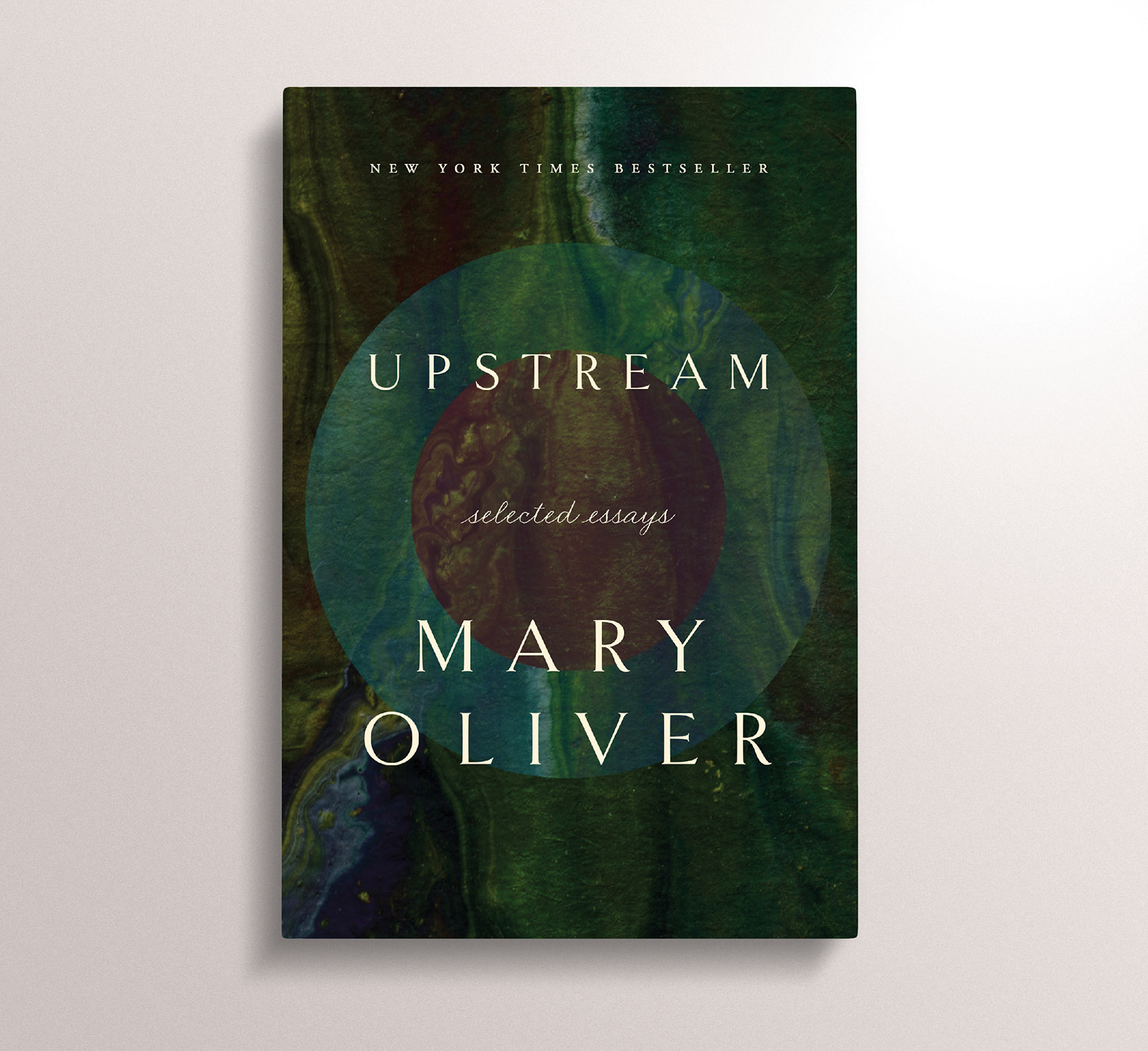
Self-directed personal project / This alternate cover for Mary Oliver's selected essays takes a slightly more abstract approach to the cover on market, while still staying close to the themes of nature and mystery.
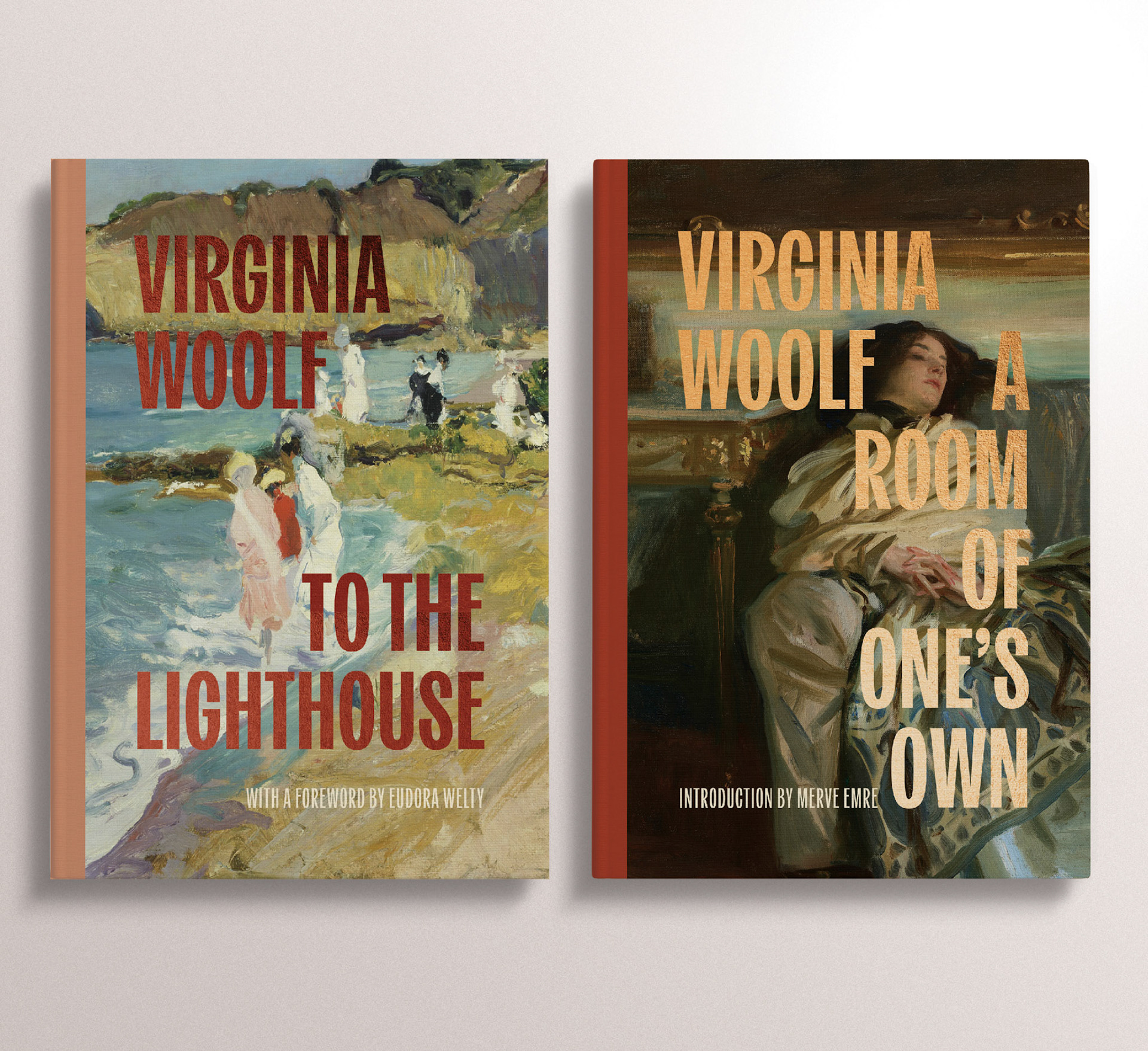
Self-directed personal project / This pair of covers for Virgina Woolf's most recognized work uses public domain imagery combined with a modern serif and subtle metallic. It also outlines a design structure that could be used for new editions of other classics.
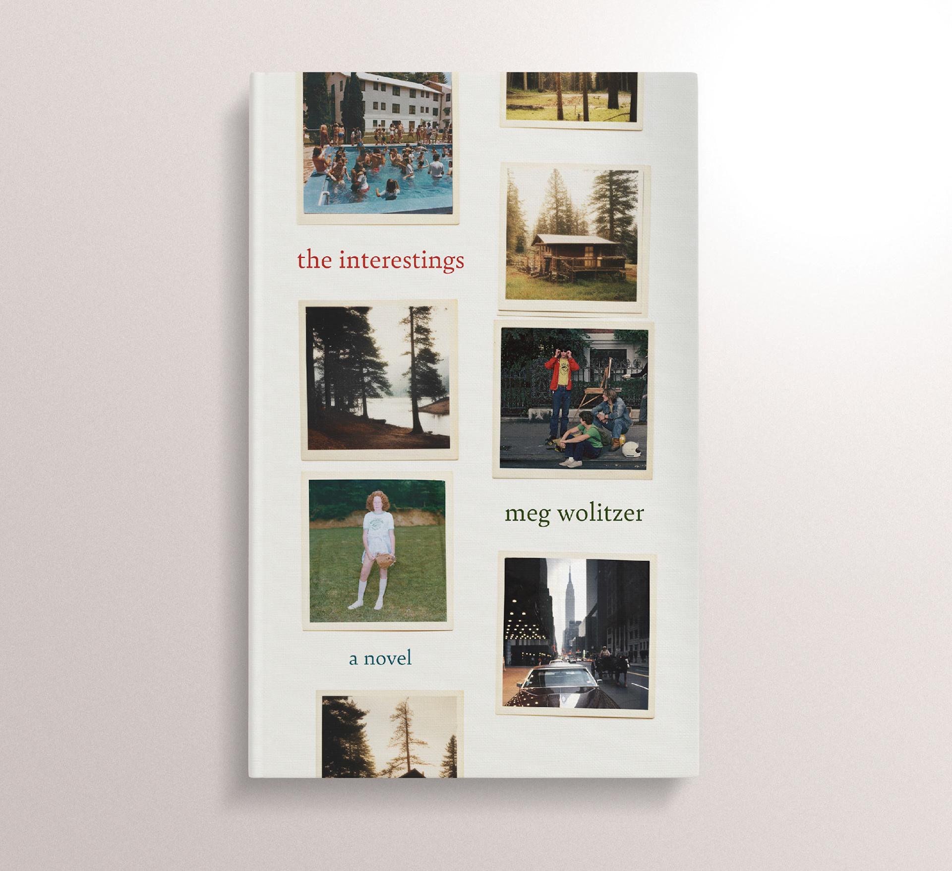
Self-directed personal project / This alternate cover for Wolitzer's The Interestings is more literal than the cover on market, using snapshots and polaroids to represent key moments in the novel, and suggest to the reader that the novel covers many years.
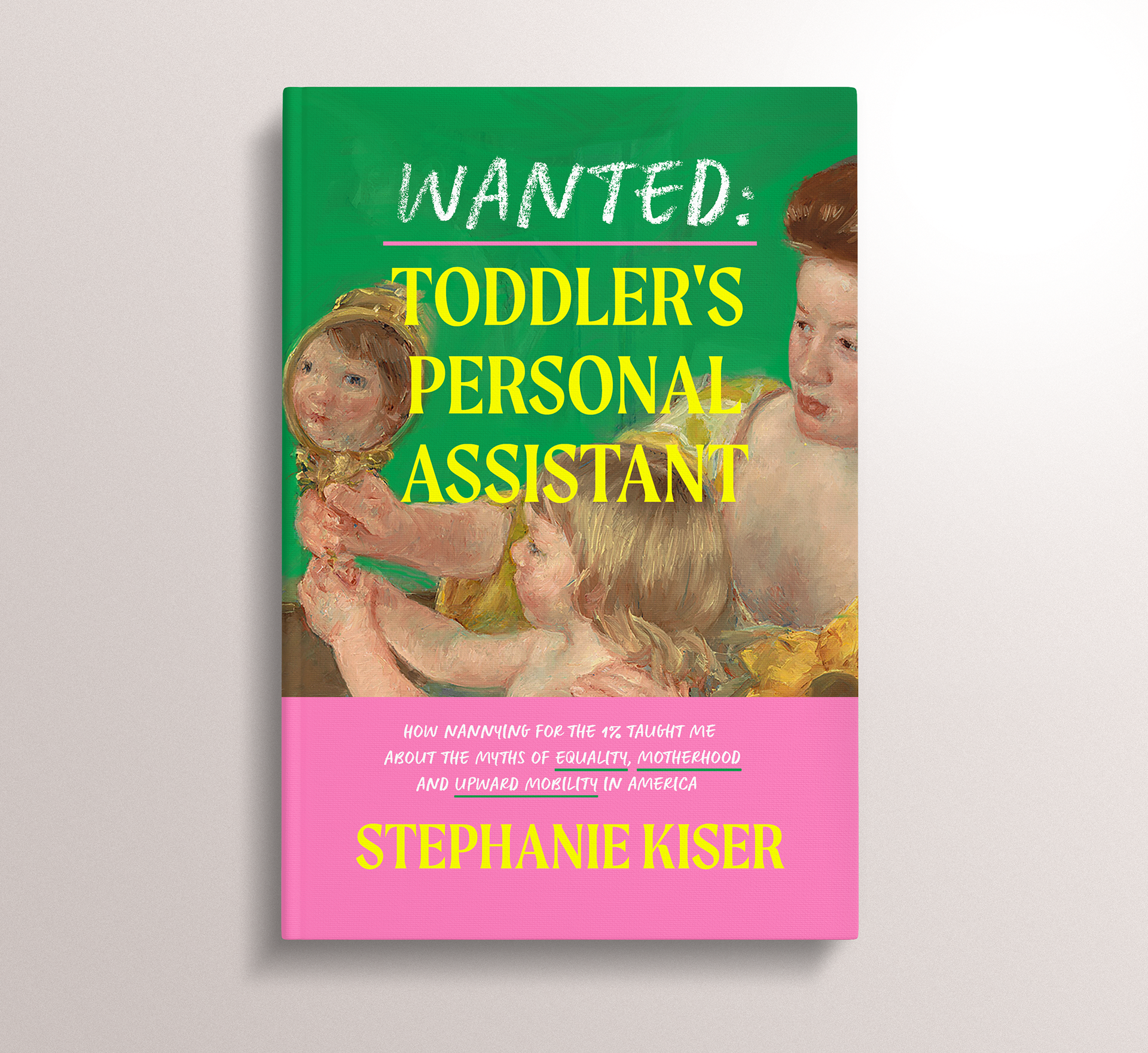
Self-directed personal project / This alternate cover is a coy and ironic take on the title, using poppy, modern colours that play against the more traditional artwork, to emphasis the timeless relevant discussions on class found within this sharp and witty memoir.
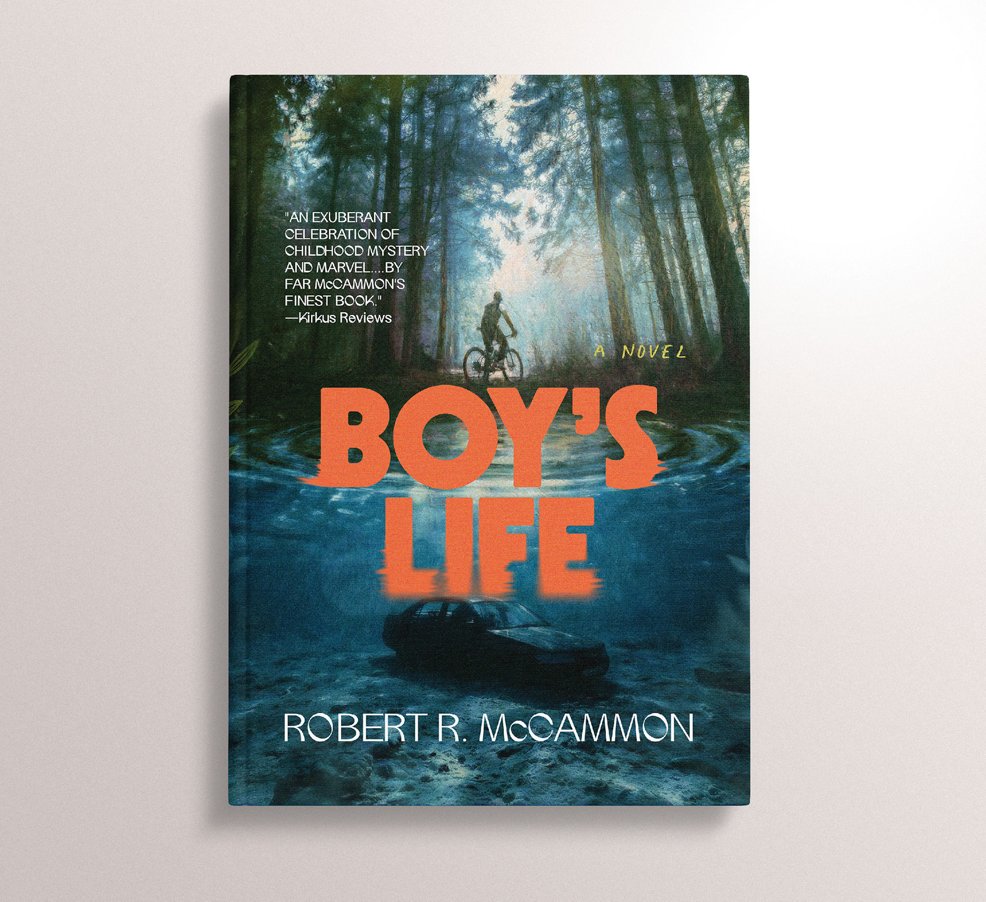
Self-directed personal project / This alternate cover for Boy's Life leans into the visual language of pulp paperbacks and coming-of-age stories of the 70s, while staying true to the southern gothic mystery that drives the story.
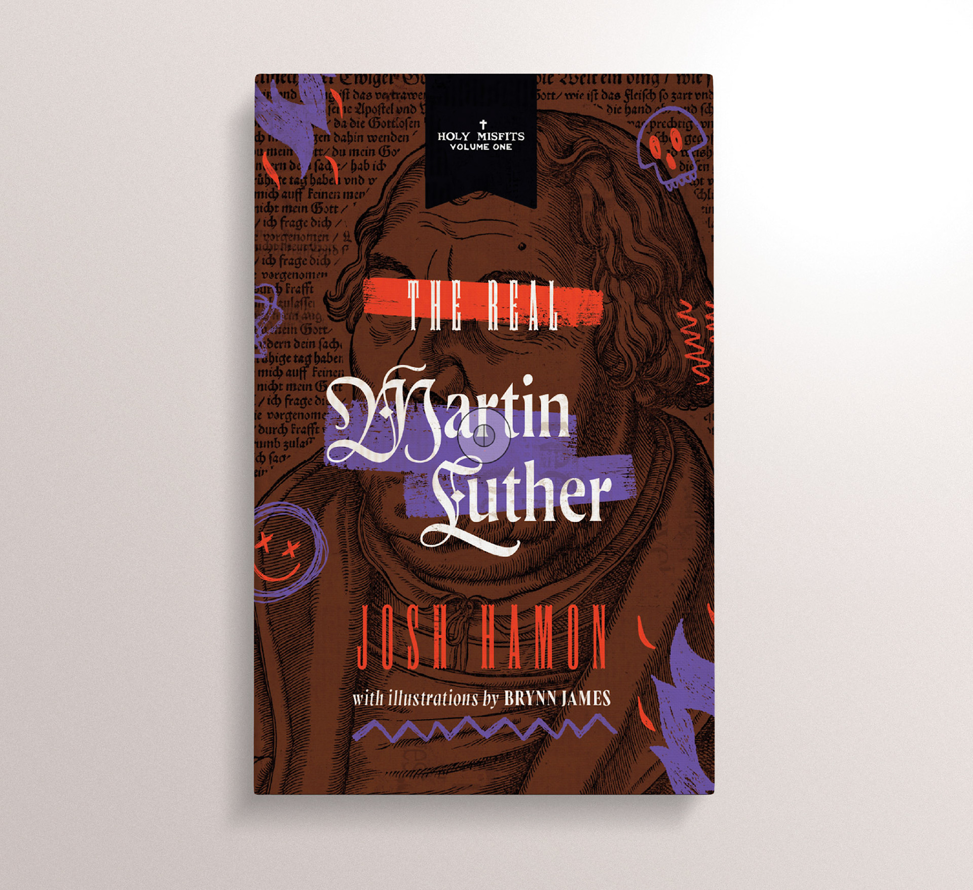
Self-directed personal project / This alternate cover for this cheeky yet informative biography on Martin Luther uses hand-drawn motifs, screen-printing effects, and wood-cut type to balance the reverent research and irreverent humour found in this non-fiction title.
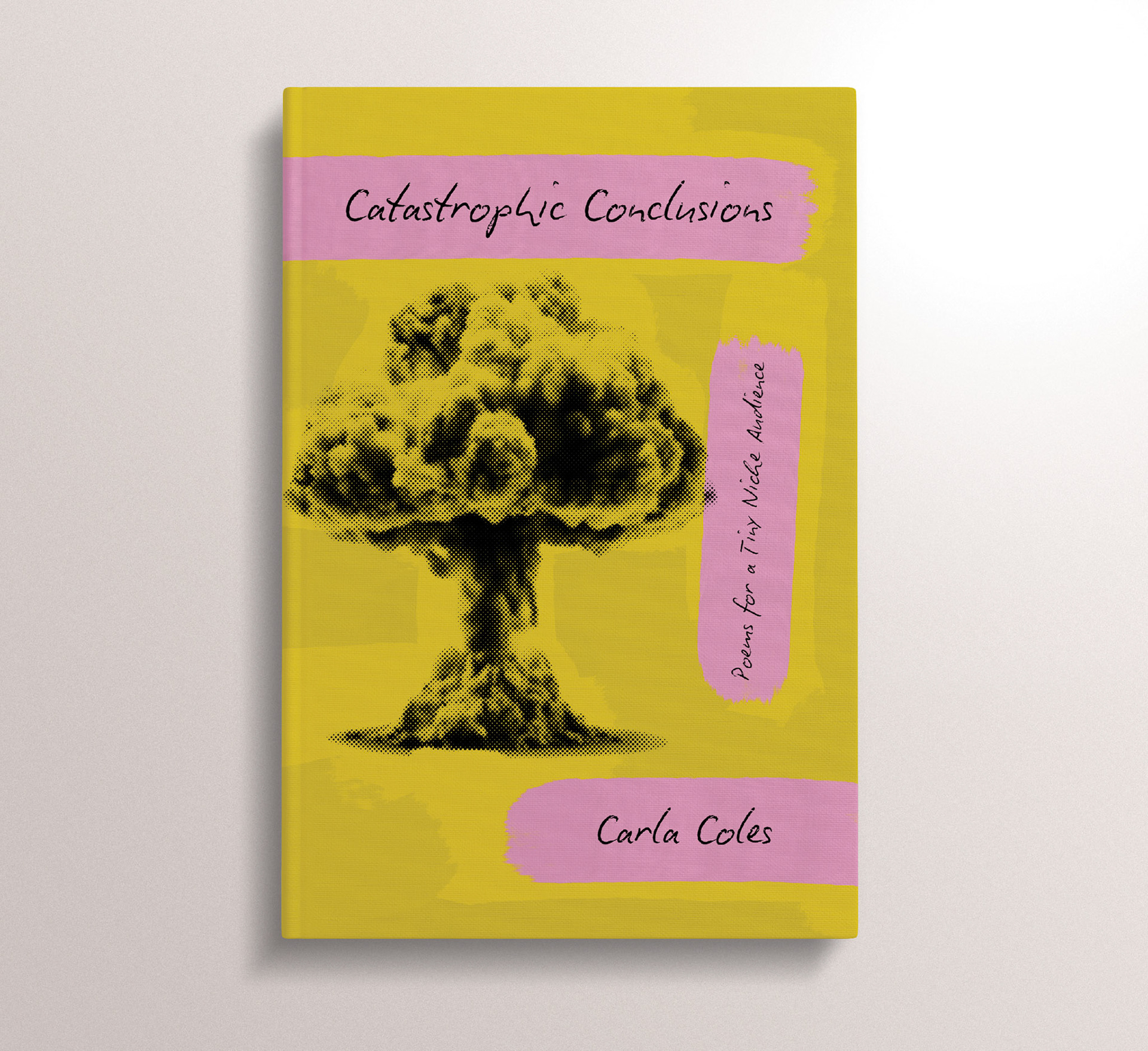
Self-directed personal project / This alternate cover for this collection of short poetry uses a typeface that reads like organic handwriting, paired with a mushroom cloud, to capture the mighty power of Cole's intimate prose.
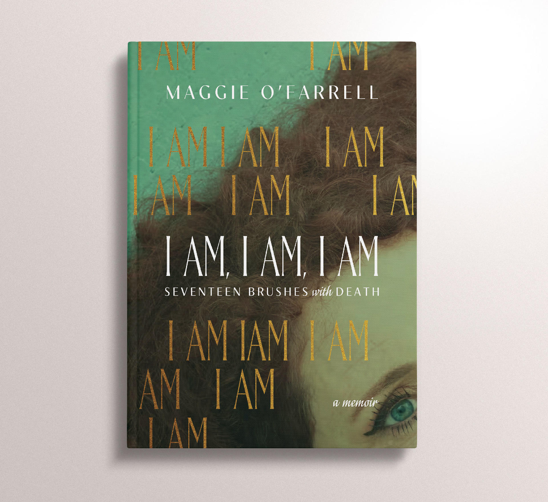
Self-directed personal project / This alternate cover for Maggie O'Farrell's powerful memoir is a more image-based approach than the type-based covers on market. The main crux of the design is a striking photo of O'Farrell herself, paired a clever interpretation of the subtitle: repeating "I AM" seventeen times.
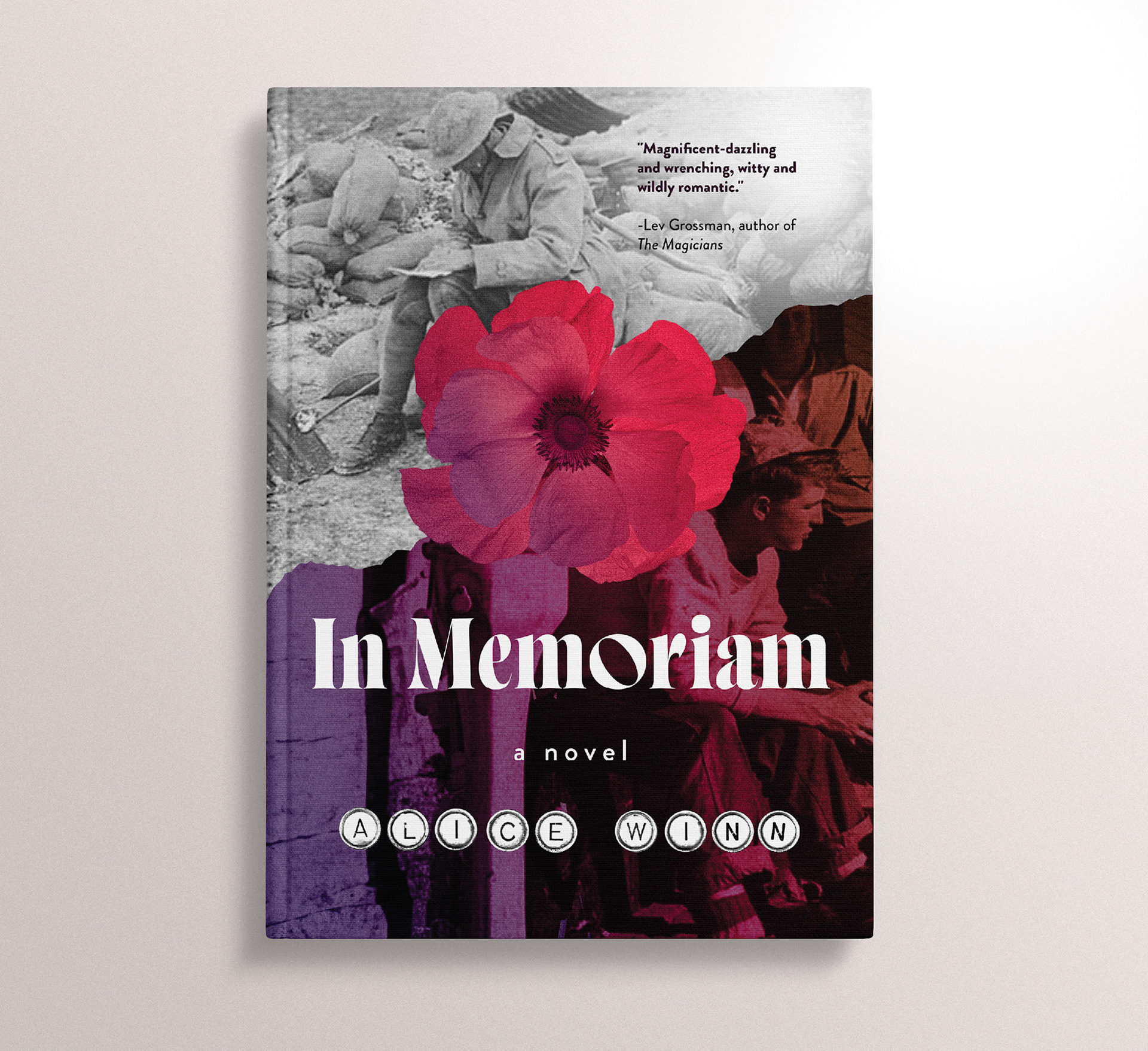
Self-directed personal project / This alternative cover of In Memoriam by Alice Winn uses period-appropriate images, one of which features a letter writer, as a nod at the epistolary structure of much of the story. It uses design tropes often associated with WWII fiction, while introducing contemporary type and colour, to allude to the revelatory queer love story that is the beating heart of the novel.
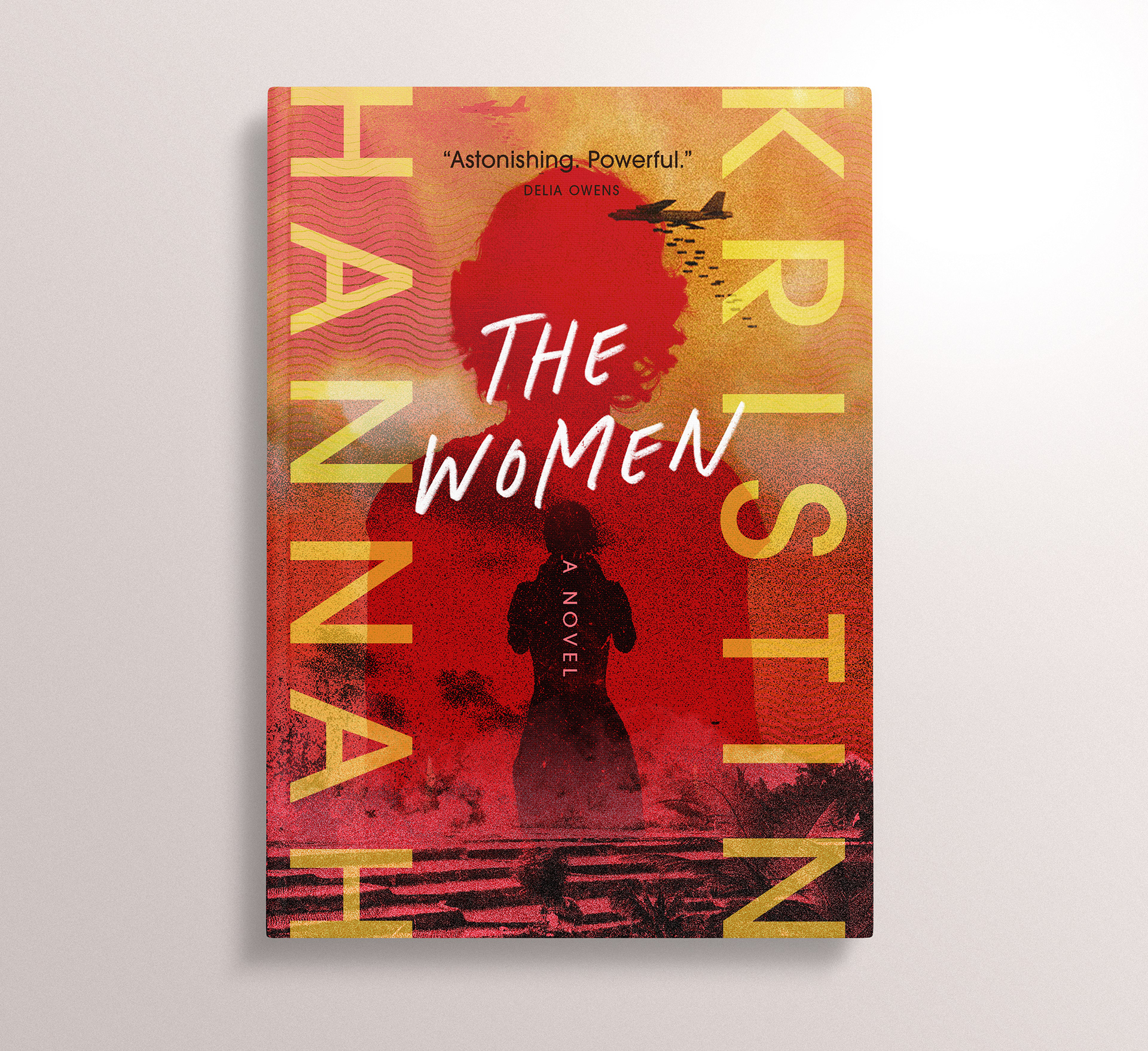
Self-directed personal project / This alternate cover for Kristin Hannah's historical fiction novel uses gritty texture, 70s type, and image layering to give the cover a real sense of authenticity and urgency. The colour palette is a nod to the Vietnam flag, as the Vietnam War is the genesis for this harrowing study of one veteran's quest for justice.
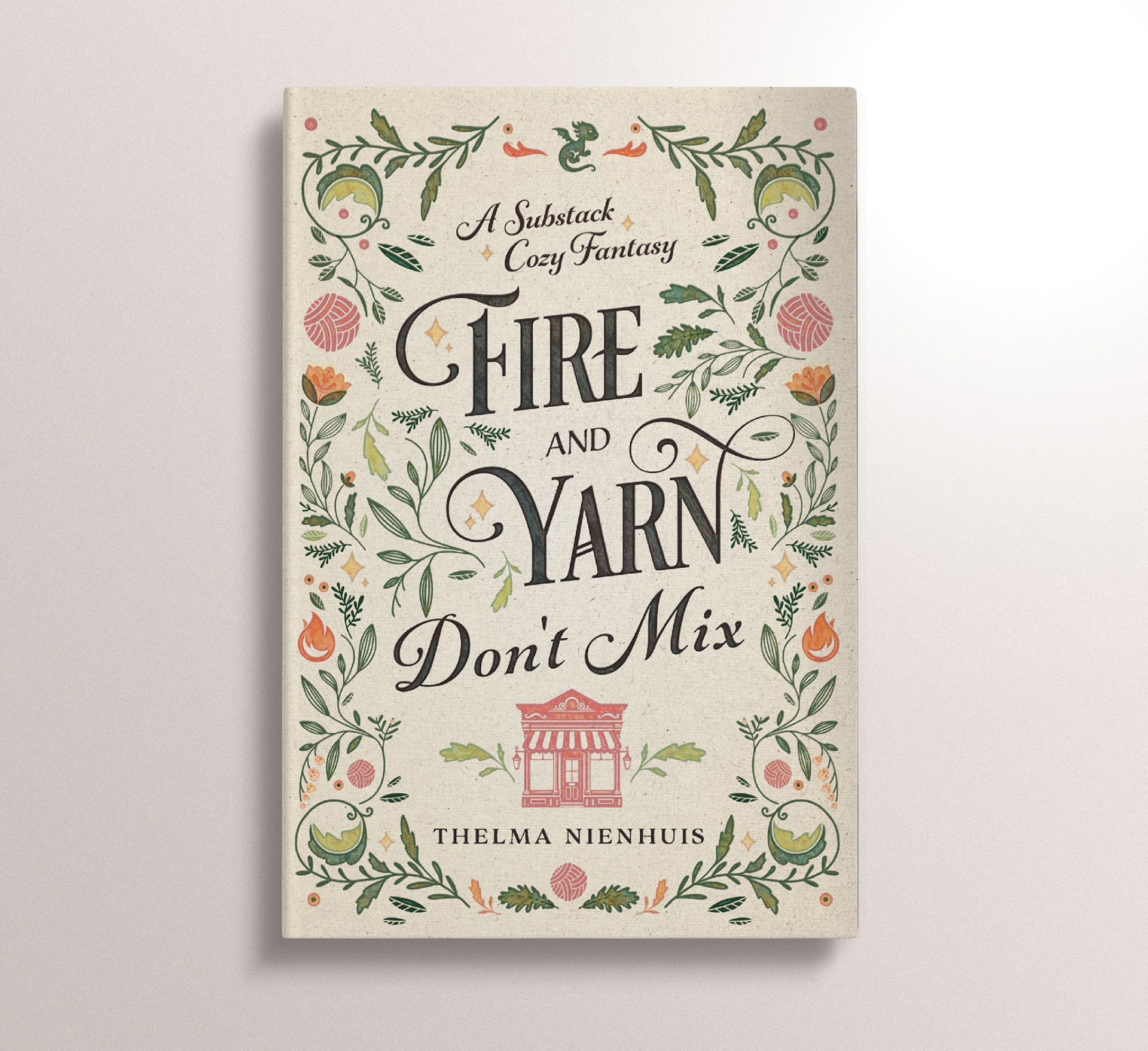
This cover for Thelma Nienhuis' cozy fantasy story uses warm textures, a soft palette, and pleasing organic illustration.
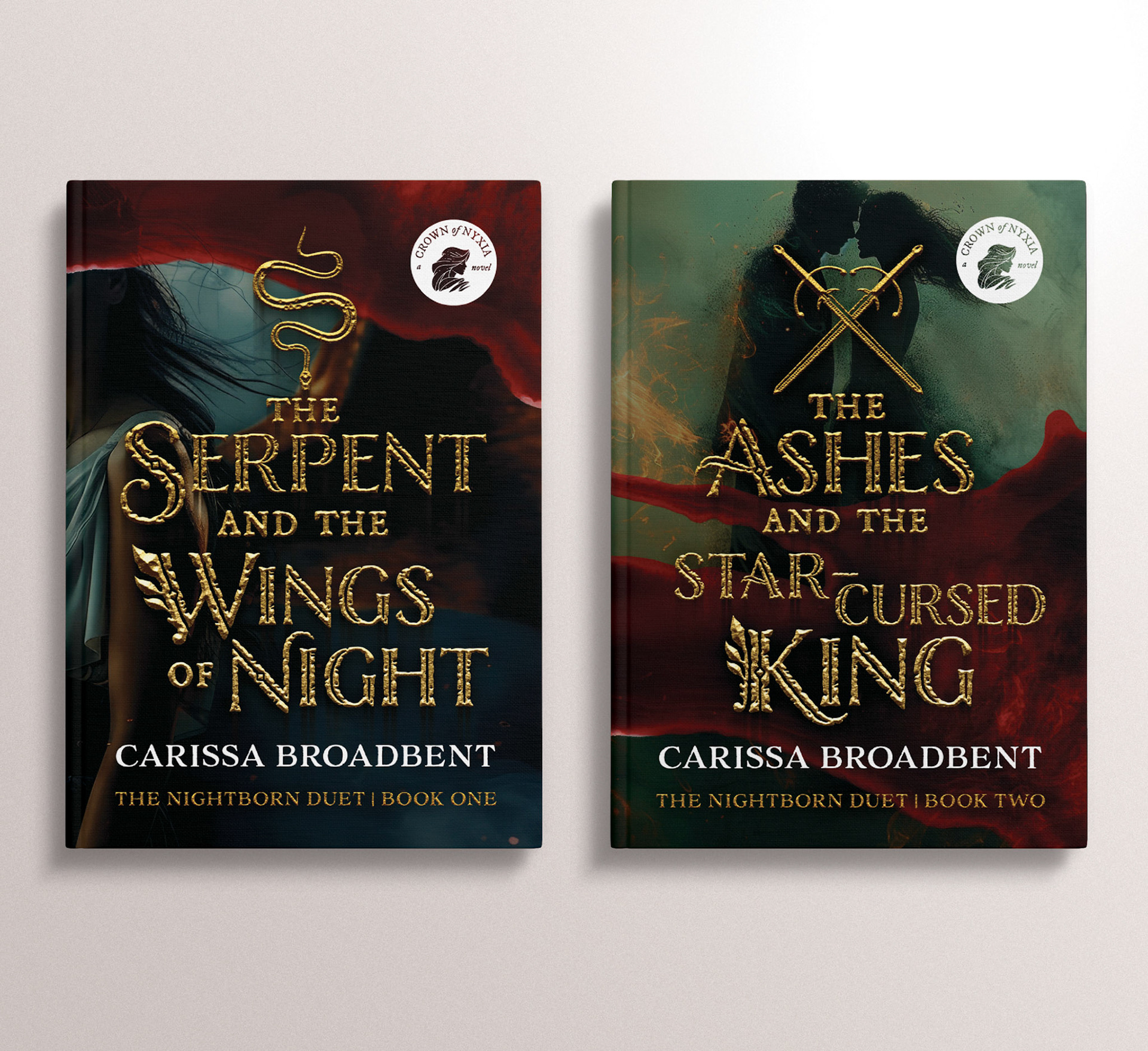
Self-directed personal project / These alternate covers for Carissa Broadbent's romantasy duet blend gothic romance, gilded text and evocative imagery to create covers that not only work as individual titles, but pair intentionally for readers that value owning a cohesive series.